Slave Voyages Data Visualisation
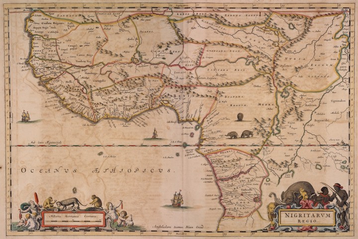 West and West-Central Africa, c.1660 from Slave Voyages
This is a short tutorial on basic data visualisation in R covering scatterplots, boxplots, violin-plots, bar charts, and grouped data. It assumes basic R knowledge (e.g., how to run a function and load a package) but it does not assume any further programming ability.
This tutorial was the result of a request by for anti-racism curriculum materials. The data used is from the Slave Voyages project. The Trans-Atlantic Slave Trade Database comprises 36,000 individual slaving expeditions between 1514 and 1866. This dataset is horrifying and so is the history contained within the graphs you will produce.
This book is part of the PsyTeachR series from the School of Psychology, University of Glasgow. Our materials are open-source and have a Creative Commons licence so you are free to reuse, remix, and adapt our work, with attribution.
The purpose of Open Educational Resources is to reduce unnecessary financial burden on students and to help share good practice. I make as many of my teaching materials open access as I can for these reasons, however, if you have found them helpful and are in a position to do so, please consider making a donation to Black British Professionals in STEM or Pride in STEM (currently by buying a badge).
Emily Nordmann
Senior Lecturer in Psychology
I am a teaching-focused Senior lecturer and conduct research into the relationship between learning, student engagement, and technology.